
Technology is changing every year, as more people than ever before are now online. The way in which our world’s online users are accessing the web is changing as well. With an array of new devices on the market, people no longer rely on a desktop computer to access the internet.
The surge in mobile and tablet users we have experienced in recent years has taught us an excessive amount about how to successfully convert users to customers by designing a mobile-friendly website. What we have grown to understand is that mobile users are goal-oriented and thrive off instant gratification. They expect to be able to get what they need immediately and on their own terms. In turn, it is important to make sure that your website is mobile-friendly.
Without further ado, here are our top 25 mobile site design principles that will help your mobile audience connect with your page.
1. Home Page and Site Navigation
-
-
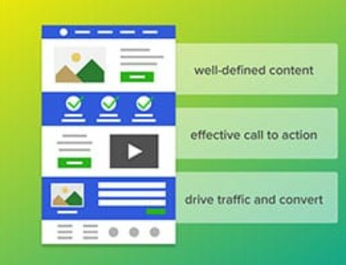
- Make sure “Calls-to-Action” are Front and Center
-
CTA’s or Calls-to-action are one of the most critical inbound marketing tools out there. They motivate and direct users to take a specific action, so it is important that mobile users are directed to this first thing when opening your site. We suggest making any secondary tasks available through menus or “below the fold” (the part of the webpage that cannot be seen without scrolling down).

Make sure that all your users’ common tasks easily available.
Don’t waste precious above-the-fold space with vague calls-to-action like “learn more”.
-
-
- Keep Your Menus Short and Sweet as to Not Overwhelm People
-
If you only take one thing away from this article, take this.
Think like a minimalist. We have learned that mobile users will not take the time to scroll through a long list of menu items to find what they want. In turn, it is important that you set up your menu to use as few items as possible so that you do not sacrifice ease and usability.

Keep menus short and sweet.
-
-
- Make it Easy to Get Back to the Home Page
-
Mobile users have come to expect that by pressing on the logo in the top-left corner of a mobile page, they will be sent to the homepage because that is often how it works on desktop sites. In turn, mobile users become frustrated when this easy access to the home page isn’t available, or your website simply doesn’t work like that.

Make sure it is easy for your visitors to get back to the home page.
-
-
- Don’t Let Promotions Steal the Show
-
Have you ever been on a website and been annoyed by the pop-up advertising that tries to steal your focus and limit your ability to read the content you were initially searching for? It happens far more often than users would like for it to because companies know that they can sell add placements in order to monetize their website, but this has the potential to greatly hurt their customer’s ability to interact with their site and even hurt their ability to find your website via Google.
Large app installs interstitials (e.g., full-page promotions that hide content and prompt users to install an app) annoy users and make it difficult to perform tasks. In addition to annoying users, sites that use interstitials may see a negative impact on their search rankings.

Promotions should be easily dismissable and not distract from the experience.
Don’t use interstitials (sometimes called door slams) often annoy users and make using the site a pain.
2. Site Search
-
-
- Make Your Site Search Visible
-
No matter if a user is on a desktop computer, a tablet, or on a mobile phone, users typically look for information via site search. Because of this, it is important to have your search field as one of the first things a user sees on your page. At Momentum3, we recommend not hiding the search box in the menu to help a user find it in a timely manner.

Make your site search visible.
Don’t hide site searchs in overflow menus.
-
-
- Ensure Site Search Results are Relevant
-
Users don’t scan through multiple pages of results to find what they’re looking for. Make life easier on users by auto-completing queries, correcting misspellings, and suggesting related queries. Rather than reinventing the wheel, consider robust products like Google Custom Search.
-
-
- Implement Filters to Narrow Results
-
A recent study showed that mobile users rely on filters to find what they’re looking for, and they are quick to abandon sites that do not have effective filters. In turn, you should place filters above search results, and help users by displaying how many results will be returned when a specific filter is applied.
-
-
- Guide Users to Better Site Search Results
-
For sites with diverse customer segments, we want to encourage you to ask a few questions before presenting the search box, and then using the customer’s responses as search query filters in order to ensure that users get results from the most relevant segment.

Help users to find what they are looking for by guiding them in the right direction.
3. Commerce and Conversion
-
-
- Let Users Explore Before They Commit
-
Mobile users have historically been frustrated with sites that require upfront registrations before allowing them to view the site. This was found to be true whether the mobile user was familiar with the brand or not. Although customer information may be integral to your business, asking for it too early may result in fewer registrations.
Allow users to browse your website without requiring them to sign in.
Don’t place login or registration too early on a site
-
-
- Let users purchase as guests
-
Study participants viewed guest checkouts as “convenient”, “simple”, “easy”, and “quick”. Users are annoyed by sites that force them to register for an account when making a purchase, especially when the benefit of an account is unclear.

Allow users to purchase your product/service with a guest account.
-
-
- Use Existing Information to Maximize Convenience
-
Make sure your website is set-up to remember and pre-fill preferences for registered users. It is also crucial to offer familiar, third-party checkout services for new users, allowing them to checkout with your product or service quickly.
-
-
- Use Click-to-Call Buttons for Complex Tasks
-
On devices with calling capabilities, click-to-call links enable users to make a phone call by simply tapping a link. On most mobile devices the user receives a confirmation before the number is dialed, or a menu is presented asking the user how the number should be handled. We consider using click-to-call links as a no-excuse option for users to be able to get in touch with your organization. Capabilities like this will help customers continue to come back to you.
-
-
- Make it Easy to Finish on Another Device
-
Users frequently want to finish tasks on other devices. For instance, they might wish to view an item on a larger screen. Or they might get busy and need to finish a task later. It is imperative that you support customers on their mobile journeys by enabling them to share items on social networks or by letting users email themselves links directly within the site.

Provide easy ways for users to continue browsing or shopping on another device.
4. Form Entry
-
-
- Streamline Information Entry
-
To streamline information automatically, we suggest that you enable users to advance to the next field when they press Return. In general, the fewer taps the user must perform, the better. Which makes sense when you think about a mobile user having to utilize a small screen when filling out any form on your website.
-
-
- Choose the Simplest Input
-
Be sure to use the most appropriate input type for each input scenario you have on your website. You can use elements like datalist that help to provide suggested values for a field.
-
-
- Provide a Visual Calendar for Date Selection
-
Clearly label start and end dates on your website. Users should not need to leave a site and check a calendar app just to schedule a date because the chances are that if they have to leave your website to open another app, they won’t come back to finish what they had started.

Use calendar widgets when possible.
-
-
- Minimize Form Errors with Labeling and Real-Time Validation
-
As you design your website, be sure to label inputs properly, and validate input in real-time. This means that you’ll be less likely to lose business, and your visitors will get the info they want. It will also help you avoid customer service headaches with people who placed orders with incorrect data.

Provide easy ways for users to continue browsing or shopping on another device.
-
-
- Design Efficient Forms
-
Take advantage of autofill so that users can easily complete forms with pre-populated data. Pre-fill fields with information you already know. For example, when retrieving shipping and billing addresses, try to use request Autocomplete or enable users to copy their shipping address to their billing address (or vice versa).
-
-
- Design Efficient Forms
-
Take advantage of autofill so that users can easily complete forms with pre-populated data. Pre-fill fields with information you already know. For example, when retrieving shipping and billing addresses, try to use request Autocomplete or enable users to copy their shipping address to their billing address (or vice versa).
5. Usability and Form Factor
-
-
- Optimize Your Entire Site for Mobile
-
Use a responsive layout that changes based on the size and capabilities of the user’s device. Study participants found sites with a mix of desktop and mobile-optimized pages even harder to use than desktop-only sites.
-
-
- Don’t Make Users Pinch-to-Zoom
-
Let’s face it, users are comfortable with scrolling sites vertically, but not horizontally. In turn, we suggest that you avoid large, fixed-width elements. Use CSS media queries to apply different stylings for different screens. Don’t create content that only displays well at a particular viewport width. Sites that force users to horizontally scroll fail the Google Mobile-Friendly Test, which may negatively impact their search rankings.
-
-
- Make Product Images Expandable
-
Retail customers expect sites to let them view high-resolution closeups of products. Study participants got frustrated when they weren’t able to see what they were buying, and allowing product images to be expanded has the potential to close a sale that you otherwise wouldn’t have had.

Make product images expandable and easy to see in detail.
-
-
- Tell Users Which Orientation Works Best
-
Study participants tended to stay in the same screen orientation until something prompted them to switch. Because of this, it is important to design your website for both landscape and portrait modes or display verbiage that encourages users to switch to the optimal orientation for viewing. Make sure that your important calls-to-action can be completed even if the users ignore the suggestion to switch orientations.
-
-
- Keep Your User in a Single Browser Window
-
Users may have trouble switching between windows and might not be able to find their way back to the site. Avoid calls-to-action that launch new windows. Identify any journeys that might cause a user to look outside your site and provide features to keep them on your site. For example, if you accept coupons, offer them directly on the site, rather than forcing users to search other sites for deals.
-
-
- Avoid “Full Site” Labeling
-
When study participants saw an option for a “full site” (i.e., desktop site) versus a “mobile site”, they thought the mobile site lacked content and chose the “full” one instead, directing them to the desktop site. We suggest not even offering that capability on your mobile site so users are not inclined to take a step that could mean you lose a sale.
-
-
- Be Clear Why You Need a User’s Location
-
Users should always understand why you’re asking for their location. Study participants trying to book a hotel in another city became confused when a travel site detected their location and offered hotels in their current city instead. Leave location fields blank by default, and let users choose to populate them through a clear call-to-action like “Find Near Me”.